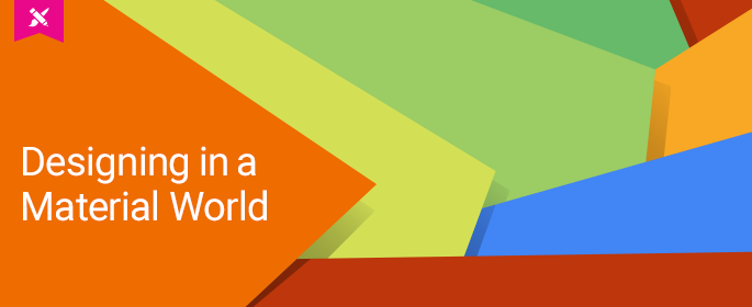
As design trends come and go, material design is the latest that has caught the attention of designers and developers alike. In this article you will not only learn what material design is, but how this latest UI design philosophy aims to merge the fundamentals of graphic design with the science of motion and light to provide a solid foundation when building a UI.
When Google unveiled its mobile design guidelines called “Material Design” at the 2014 I/O developers conference, it was received with mixed emotions across the design and development communities, but little did they know that it was the birth of a new mobile design methodology.
With mobile design in a state of constant evolution, Google’s design team has paid close attention to how the UI should look and behave from both the design and scientific perspectives. Google’s ultimate goal was to create a flexible, cross-platform system for UI design that is screen agnostic and puts motion at the heart of it.
What is Material Design?
To understand material, it’s important to first, understand the space it lives in. The material environment exists in a 3D space within the screen, all the elements are assigned x, y, and z dimensions. The z-axis is aligned perpendicularly to the plane of the display, extending content out towards the viewer.

Image credit: Making Material Design
Material is based on three founding principals:
Metaphor – This principle was inspired by the study of paper and ink, grounding the user and setting up the expectations of how the space and motion will work together as the user interacts with the UI. While the user can’t physically feel the design elements on the screen, the transition animations are designed to feel very natural and expected.

Image credit: Making Material Design
Bold, graphic, intentional – This rationalizes the need for UI elements to be placed within a grid system not only for consistency, but to create visual hierarchy and meaning behind the design. Everything has been thought out to present the user an intuitive experience with meaning behind the form and function.

Image credit: Making Material Design
Motion Provides Meaning – Motion is so important to the overall design aesthetic of material. Giving meaning to how motion is handled, while unifying all the principles. Motion is used to efficiently guide the user and gently bring them through the experience.

Image credit: Making Material Design
The Evolution of Material Design
When material design was in it’s infancy, it felt like an attempt by Google to try and play catch-up to Apple by introducing some brand awareness and design harmony into Android based apps.
Due to the differences across platforms, establishing UI functionality for users was approached in drastically different ways. This always bugged me, the lack of consistency made it so difficult when having to design a cross platform UI.
This design challenge forced you to make tough decisions in order to establish design consistency at the expense of the user. You would have to either have to find the middle ground between platforms or be forced to choose which features and functions took priority for the user.
Over the course of the past two years, material has evolved into an intuitive method to design interfaces that look and feel human and most importantly remain consistent to the user regardless of the screen size that is used to view the content.
Using this methodology will prepare you and your team for unforeseen design challenges. Television, Auto, and Virtual Reality UI design are quickly becoming mediums that will need to co-exist along side mobile content that users will expect to look and function constantly as they shift to larger screens or other devices.
The Google Design website is a good resource to help you successfully build mobile interfaces that leverage the thinking behind material. This site is a living breathing resource loaded with tools and downloads to help designers and developers on material design.
A few of the tools available are:
Resizer – This is an online tool to visually see how your material UI is translated across break points. This can be a valuable tool to aid in conversations between designers, developers, and stakeholders about responsive UI.

Image credit: Making Material Design (view large image)
Layout Templates – The Google design team created a set of “Whiteframes” in Desktop, Tablet and Mobile breakpoints to quickly get you building material UIs. They include multiple templates, structures and tips to start your material design off in the right direction.

Image credit: Making Material Design (view large image)
Device Metrics – This tool includes detailed information and recommended material design measurements, and values for portrait and landscape orientations across most devices and screen resolutions.

Image credit: Making Material Design
Material has changed the game on how the design and dev community approaches UI design. This level of detail around the design of a UI is being discussed at a perfect time. Users knowledge of how to interact with a mobile touch UI began with Apple’s take on skeuomorphism that evolved into the iOS we know today and has paved the way to push the boundaries in how we communicate with users.
The design community has reacted with both acceptance and resistance. Like many other design methodologies, there is research involved from both design and development teams, when deciding to follow the material style.
Limitations of Material Design
While material offers a lot of flexibility, where it falls short is in the ability to experiment with different motion effects. The guidelines lock you into the behavior of how motion should be handled. By following the material guidelines, pass through, bending and folding of elements is not recommended, so make sure you know the limitations and restrictions and how they would apply to your project.
It’s definitely not something to jump into and implement overnight, you really have to do your homework to see if it’s the right fit for your workflow.
Material Design Done Right
At the 2015 Google I/O, the first material design awards debuted. These awards were presented to those who use the material design methodology in the creation of intuitive user experiences. The winners are featured in a collection on the Google Play store.
Six winners were chosen at the 2015 I/O conference and represent the best in all aspects of material design. These winners are a perfect way to really understand and appreciate material design.
A few of the winners were:
Please check out more award winning apps created using the material design method.
Does material have staying power?
Material design is coming of age and has built up the momentum to be seen as a smart, intuitive way of designing the UI experience needed to deliver content across platforms, devices, and screen resolutions.
The future of material is really in the hands of designers and developers, pushing it into new directions and applying it across various platforms. It’s not without its faults, but it is a solid guide to follow.
With its foundation set so deep in scientific perspectives, it’s the best attempt so far at creating a set of future proof design guidelines.
Visit design.google.com for more on material design news and resources to get you started designing in a material world.
Share your thoughts and designs on twitter using #MaterialWorldDesign.


